About Me
Hello! I'm Linus, a 19-year-old Physics undergraduate at the University of Bonn. With a foundation in creative technology and project management, I recently graduated from SGG Bingen (Abitur grade: 1.8) and am now channeling my passion for systems—both physical and digital—into my studies and freelance work.
(Curious about the name 'Immineal'? It's a blend of 'imminent' and 'real'.)
My passion lies at the intersection of design, technology, and management. I thrive on bringing ideas to life visually and ensuring projects run smoothly from concept to completion.
My core strengths include:
- Graphic Design: Proficient with the Affinity Suite (Designer, Photo, Publisher) for creating logos, layouts (like a 200-page magazine), flyers, and other visual materials. Quick learner, open to mastering Adobe Creative Suite.
- Project Management: Experienced in planning, scheduling, coordinating teams, and managing finances transparently. Successfully managed events like the Abiball (catering, schedule for 400+ attendees) and the complex Abizeitung project as Editor-in-Chief. Familiar with tools like Trello.
- Technical Skills:
- Programming: Proficient in Python for data analysis (Pandas), machine learning (Keras, TensorFlow), and automation. Experienced with C++, Web Development (HTML, CSS, JavaScript), PHP, and LaTeX.
- Systems & Hardware: Dedicated Linux user (openSUSE Tumbleweed, Arch) with experience in dual-boot systems and local server management. Skilled with Git/GitHub for version control.
- 3D & Video: Advanced user of Blender (7+ years) for 3D modeling and animation. Proficient in Davinci Resolve Studio for video production.
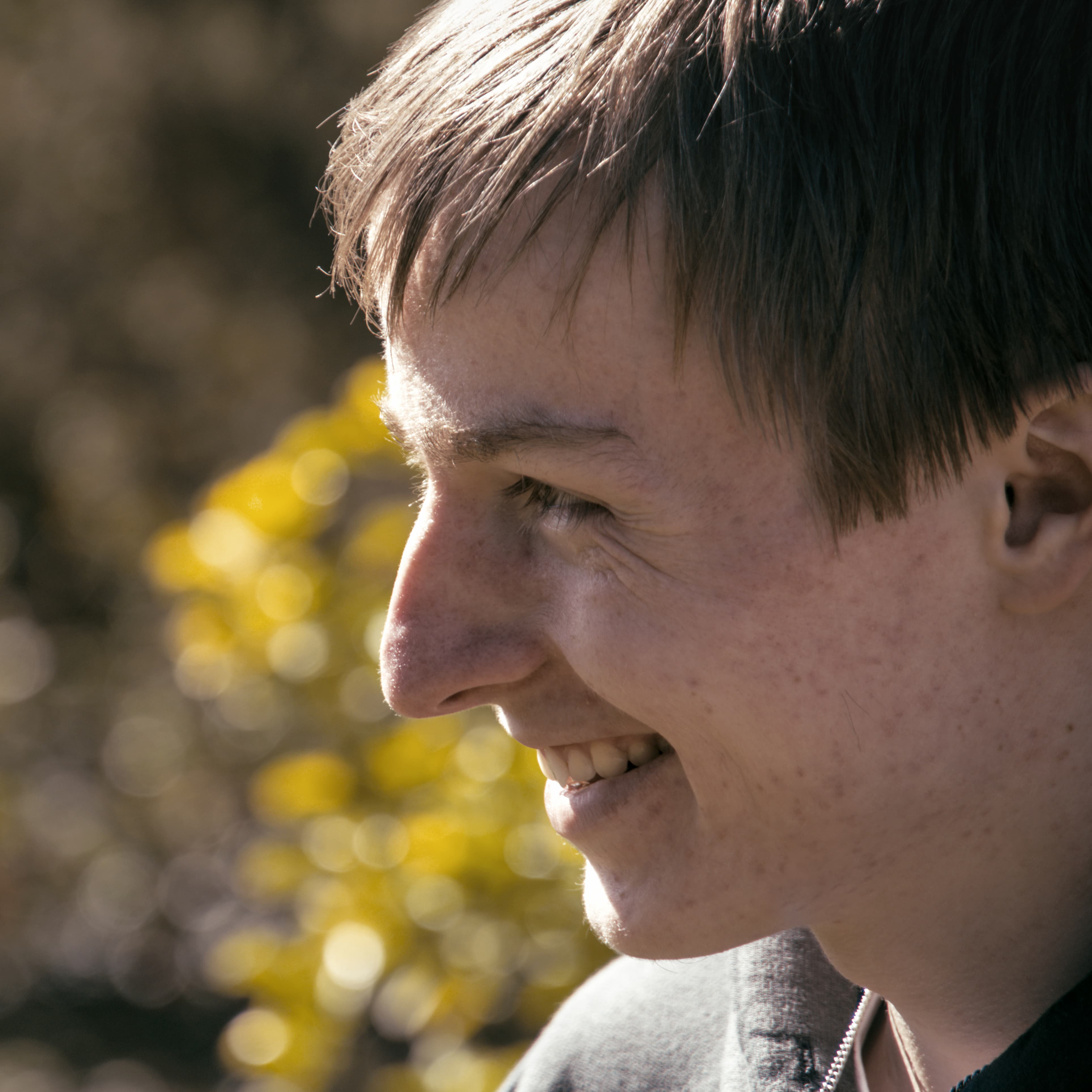
- Photography: Skilled in both digital (Sony a6700) and analogue (Fujica ST801) portrait photography, focusing on capturing personality and mood.
I'm currently exploring opportunities where I can apply my skills creatively and analytically, contribute to meaningful projects, and gain further experience.
Key Skills & Tools
Creative Achievements
- 2025 Rhineland-Palatinate U20 Vice-Champion in Poetry Slam.
- Co-host and producer of the "Zwischenzeugnis" podcast, available on major platforms.
- Active member of the student theater group "Kurfürstliches Hoftheater Bonn."
- Awarded the 2025 Schulleiterpreis (Headmaster's Award) at SGG Bingen for outstanding engagement in the school community.
A Note on the Design
The visual identity of this website aims to reflect the 'Immineal' concept: making the tangible ('real') meet the present ('imminent'). It blends classic craftsmanship with modern clarity.
- Color Palette: The foundation rests on warm, natural tones – an off-white 'paper' (#faf6f2) and a deep 'ink' brown (#2a2621) – providing a calm, readable base reminiscent of quality print. The key accent, an aged Terracotta (#c44d3c), brings warmth and makes important elements stand out, signifying ideas brought to fruition. Complementary Moss Green (#6b9080) adds a touch of natural stability and thoughtful detail.
- Typography: We pair the classic elegance and high readability of 'Libre Baskerville' for body text with the distinct, geometric precision of 'Space Grotesk' for headings. This contrast mirrors the blend of established quality and forward-thinking execution.
- Overall Feel: Subtle textures and a clean layout strive for a feeling of 'analog care' – thoughtful, deliberate design in a digital medium, ensuring content is both engaging and accessible.
I believe in combining meticulous planning with creative execution to achieve outstanding results. I'm eager to learn, adapt, and pour my energy into challenging and rewarding work :D